

A warm happy new year to all Nutanix community.
As a Nutanix SE role one of my objective is to collect customer feedback not only on features and functionality but also for UI and UX (user experience).
I often get some user interface feedbacks from customers while doing HPOCs or Demos, but I would like to understand if you can help us improve even more. I would like to understand what are the main areas where our graphical interface could be a little better.
⚽🏀🎾 I want to play a little game with everyone would like to join 🏏🏈🏐
[Game Rules]
- Post a screenshot of our interface (feel free to blur out some information)
- Highlight some areas of the screenshot
- Write down where the screenshot is coming from (PC, PE, Security Central, Nutanix Central)
- Send a comment on what could be improved referring to highlighted areas
My turn:
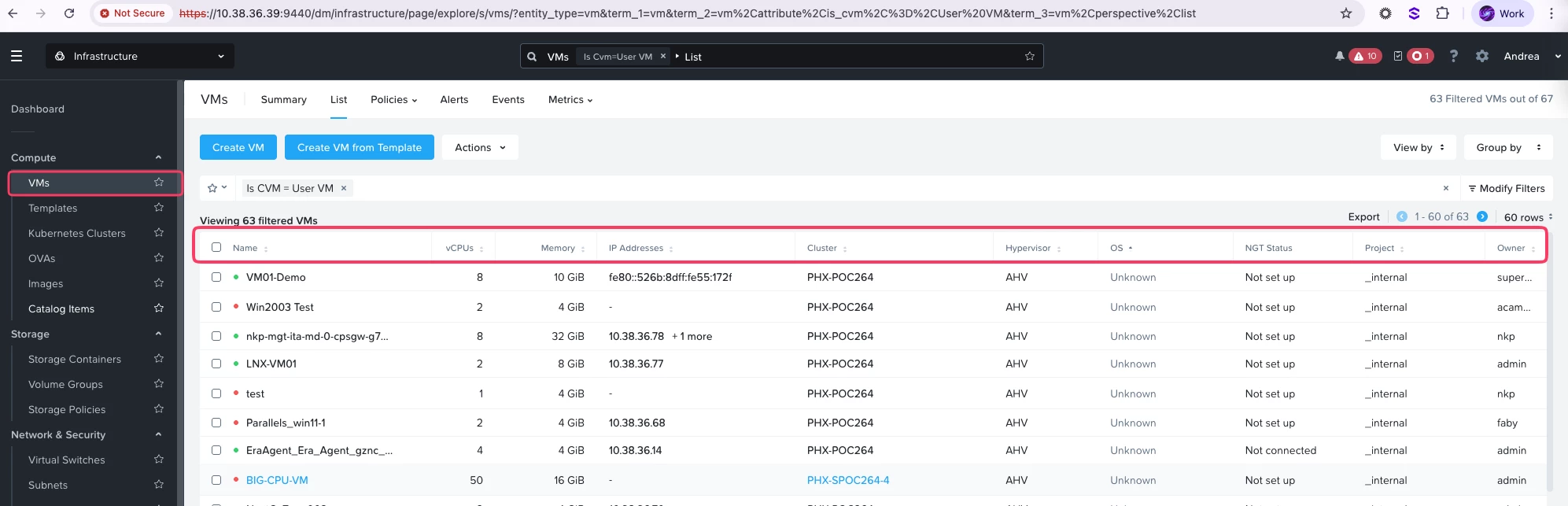
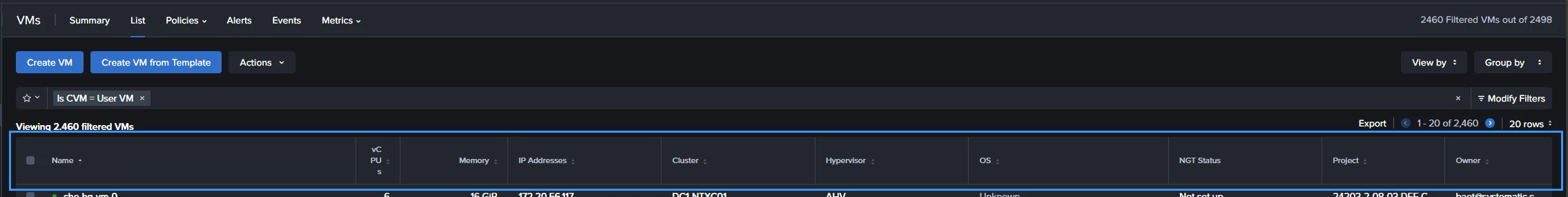
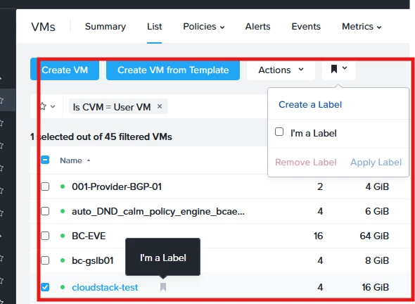
- From Prism Central
- I would like that these columns in VMs view would be more customizable with additional parameters like for example: Disk space occupied By VMs; Categories assigned to the VMs.
Your turn!