


Elevate Your Reports With Grouping
With Nutanix Cloud Manager you can create your own custom reports with either custom or pre-defined views. (To learn more about reporting basics, check out this video)
In the video below, I show how you can use the grouping functionality to group all your views by a specific entity using the custom group view. After watching the video, keep reading to learn more about different ways to use grouping!
There are two ways to group entities:
-
Custom Group View
-
Group Data within a Custom View
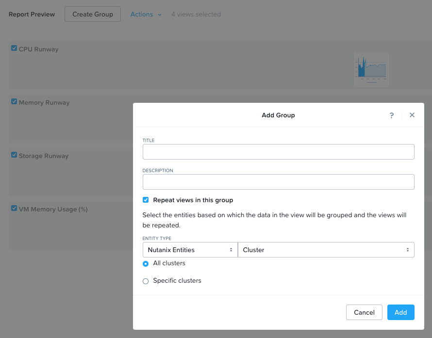
You can use the custom group view either by selecting all the existing views and clicking on Create Group, or adding a group using the custom Group view and adding views to that group.
There is also the ability to group data within a custom view itself. For example, if you wanted to create a line chart to display VM memory usage, you can group by cluster within this view under Advanced Settings.

So what’s the difference?
When grouping data within a view, you will see a separate view for each grouped entity. For example, with the line chart example above, for two clusters, you will see:
-
VM Memory Usage for Cluster1
-
VM Memory Usage for Cluster2
If you were to use the custom group view for the same line chart and also group by Cluster, you would see it like this:
-
Cluster 1
-
VM Memory Usage
-
-
Cluster 2
-
VM Memory Usage
-
Not much difference here, however, if you’re using other views within your report this is where you’ll see a difference. For example, if you have two line charts for memory and CPU and you group data within the view you’ll see:
-
VM Memory Usage for Cluster1
-
VM Memory Usage for Cluster2
-
VM CPU Usage for Cluster 1
-
VM CPU Usage for Cluster 2
If you put those both into a custom group view you’ll see all the line charts for Cluster 1 first, followed by all the line charts for Cluster 2.
-
Cluster 1
-
VM Memory Usage
-
VM CPU Usage
-
-
Cluster 2
-
VM Memory Usage
-
VM CPU Usage
-
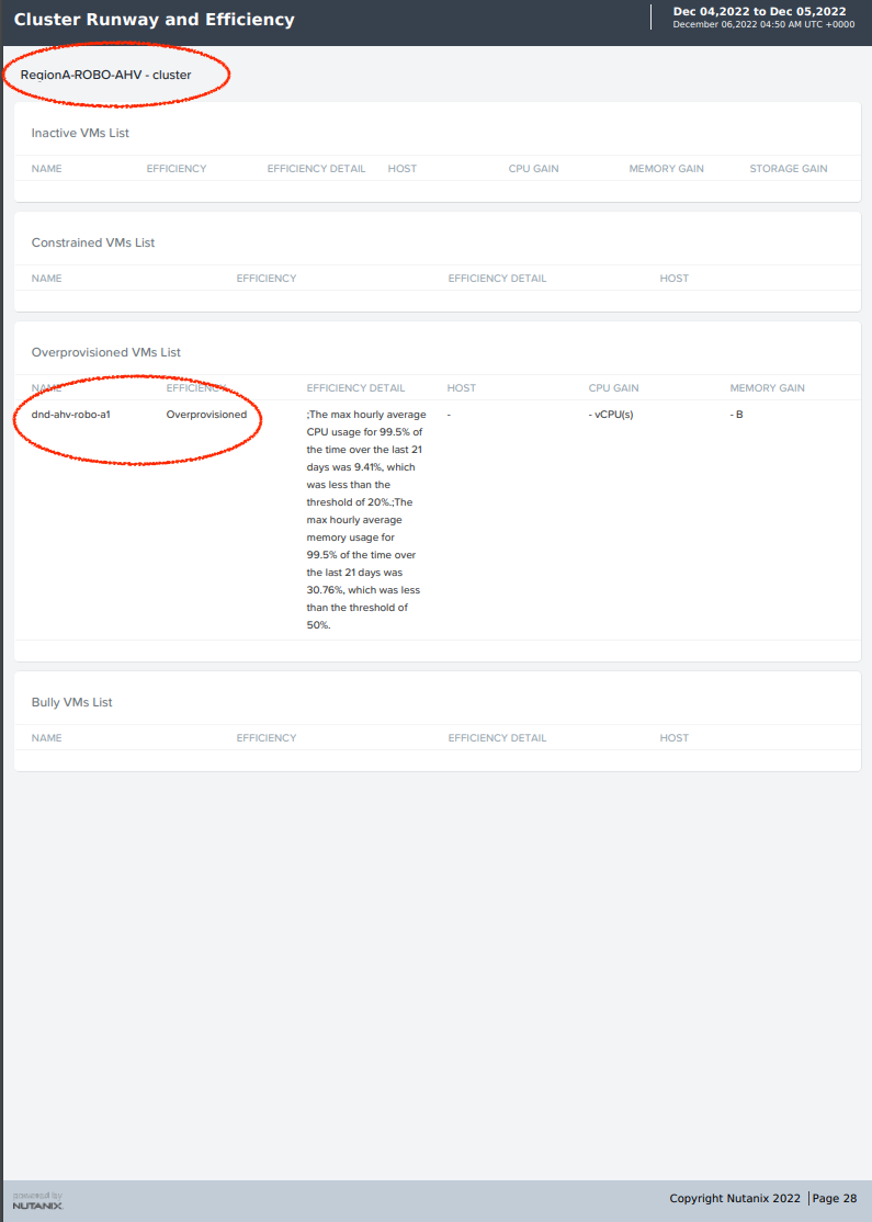
Additionally, custom group views are the only way to break out the predefined views by cluster or other entities, as predefined views cannot be modified, and by default will combine all entities together in one view. In this example, we’re using the Overprovisioned VMs List pre-defined view:
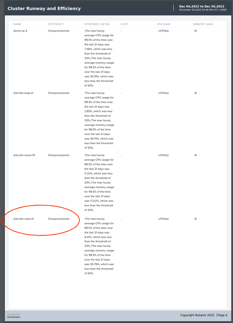
When grouping by cluster using the custom Group view, we can identify the highlighted VM above as belonging to the RegionA-ROBO-AHV cluster.